Introduction
This guide is our playbook. The rules of the game. The blueprint that keeps Mint looking sharp, feeling bold, and carrying the same energy everywhere our brand appears.
Mint is not here to blend in. We are a crypto casino built for the degen era. Fast. Fun. Disruptive. Our brand reflects that attitude. Clear lines. Strong presence. No boring corporate filler.
Inside you will find everything that makes Mint feel like Mint. Our colours. Our typography. Our tone. The principles that keep every screen, banner and asset hitting with the same power.
Whether you are designing product screens, ads or full campaigns, these guidelines make sure every touchpoint delivers the same vibe. Confident. Clean. Unmistakably Mint.
01
Brand
The casino world is crowded with copycats. Same designs. Same mechanics. Same experience. Players are ready for something new but the industry keeps serving the same old formula.
Mint is here to break that cycle.
Born from the idea that gaming should feel exciting again, Mint was created with one mission. Build the next generation of crypto casino. A place where the experience feels fast, clean and rewarding. A place that mixes crypto culture with elite casino operations. A place players actually want to return to.
We believe the future belongs to brands that move with clarity and confidence. Brands that cut through noise. Brands that respect the player and deliver real value. That is why Mint focuses on three things. Precision in our product. Swagger in our brand. A player experience that always delivers.
Mint is not here to follow old rules. We build what we want to play. We build what the culture wants. And we build it for players who expect more.
The casino world needed a reset. Mint is the reset.
02
Personality
Mint’s voice is the personality behind everything we say. It is how we show confidence, attitude, and intent. The way we speak shapes how players feel about the brand. When we communicate with clarity and purpose, the entire experience feels sharp, fun and effortless.
Our tone is bold, playful and confident. We keep things simple. We cut the clutter. We talk to players like real people. No corporate nonsense. No confusion. Just clear language that keeps the energy high and the experience smooth.
Mint speaks with swagger. Mint speaks with precision. Mint makes every interaction feel easy so players can focus on what they came for. The fun. The thrill. The game.
Tone & Voice
MINT speaks with a creative, fearless, and champion mindset. The voice always leans forward, thinks differently, and leads from the front. Every message should feel premium, culturally sharp, and unmistakably alive.At a minimum, each execution blends two of our core style attributes:
- Entertaining (never boring)
- Disruptive (breaking norms with purpose)
- Human (an honest, conversational voice).
The tone is confident but never corporate, bold without being abrasive, and always designed to spark curiosity, energy, and momentum.
Our Vision
To create the next evolution of crypto gaming by blending premium casino play with real Web3 culture and on-chain innovation.
Our Mission
Provide a fast, premium and culturally driven casino that mixes classic gameplay with Web3 originals, arcade style on-chain games and modern crypto experiences no one else offers.
Our Promise
Deliver a smooth, high quality and constantly evolving iGaming experince that delivers real excitement, real innovation and a level of Web3 integration that traditional casinos simply cannot match.
03
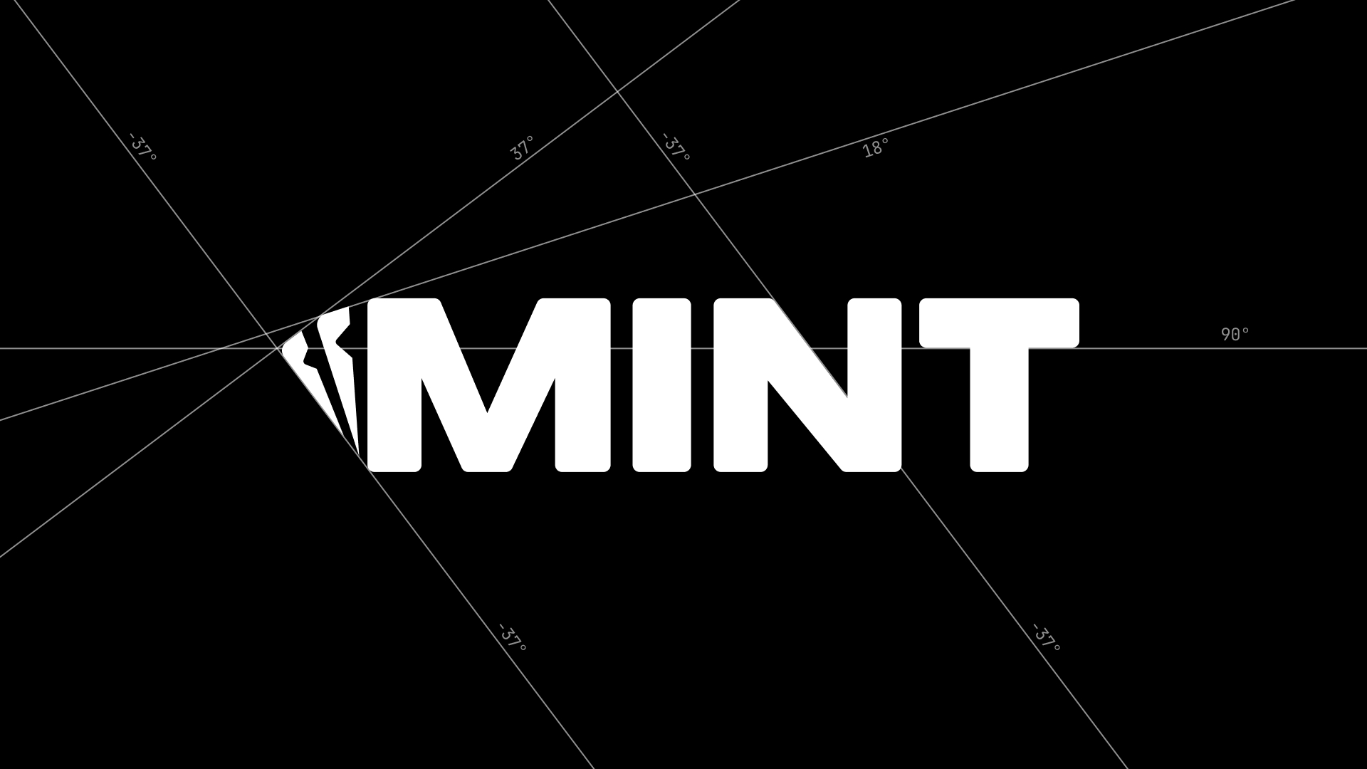
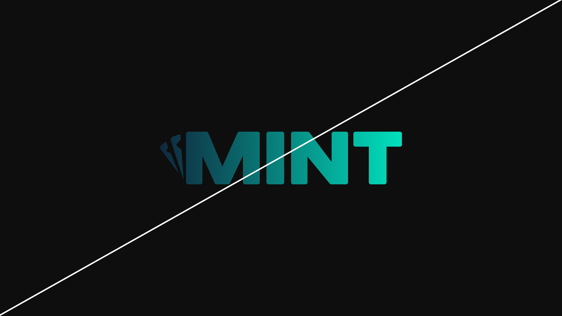
Logo
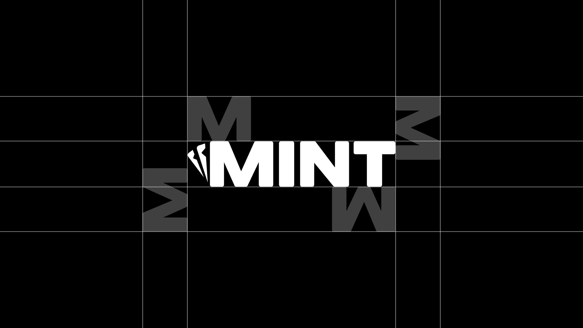
The Mint logo is bold, clean and built to stand out. The two cards tucked behind the M give the wordmark instant energy and attitude. It is a subtle nod to casino culture without feeling cheesy or predictable. It feels premium. It feels sharp. It feels Mint.
The heavy letterforms give the logo real presence. The angled cards add movement and direction, almost like the brand is in motion even when it is sitting still. It signals play, choice and momentum in a single shape.
The Mint logo is more than a mark. It sets the tone before a single word is read. It tells players they are stepping into a modern casino built with intention, confidence and style. It is simple, iconic and unmistakably ours.
Primary Lockup
Secondary Lockup
Clearspace
Incorrect Usage

Do not alter logo elements
Do not stretch or compress the logo
Do not type out the logo
Do not rearrange the logo
Do not outline the logo
Do not add effects to the logo
Do not rotate the logo
Do not add gradients to the logo
Do not add images to the logo
04
MASCOTS
The Mint Bears
Our mascots are the heart of the Mint world. A polar bear and a black bear. Two sides of the same energy. Cool precision and bold presence. Calm confidence and loud attitude. Together they capture the full Mint personality.
They are modern. They are stylish. They feel real without being serious. They bring life, culture and personality to everything they appear on. They help us communicate with confidence and clarity while keeping our brand fun and unmistakable.
When players see the bears, they know they are in Mint territory.
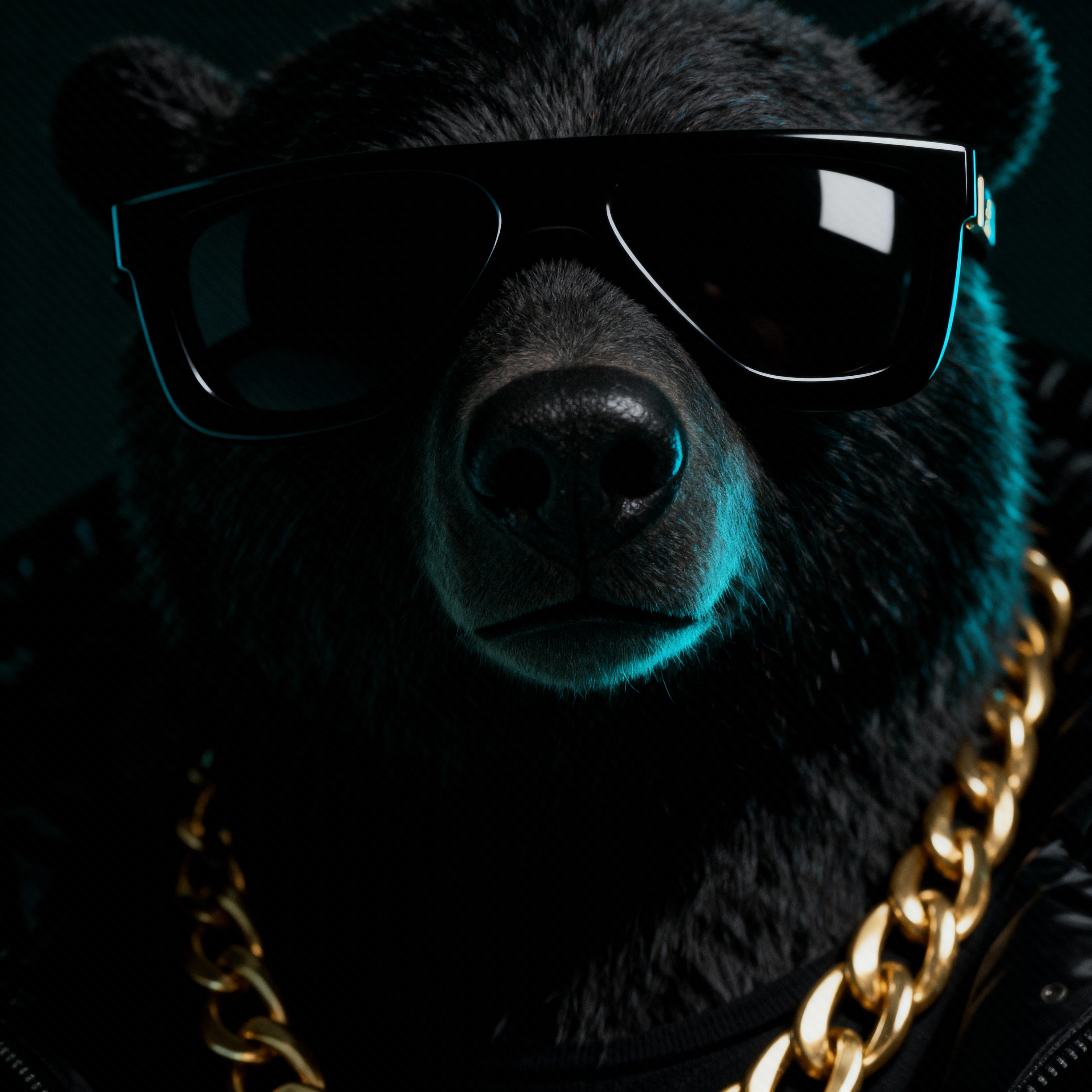
Cool. Clean. Controlled.
Photography should feature modern, well-lit workspaces with a clean and organized feel. The focus should be on clarit, avoiding clutter or overly dramatic compositions.
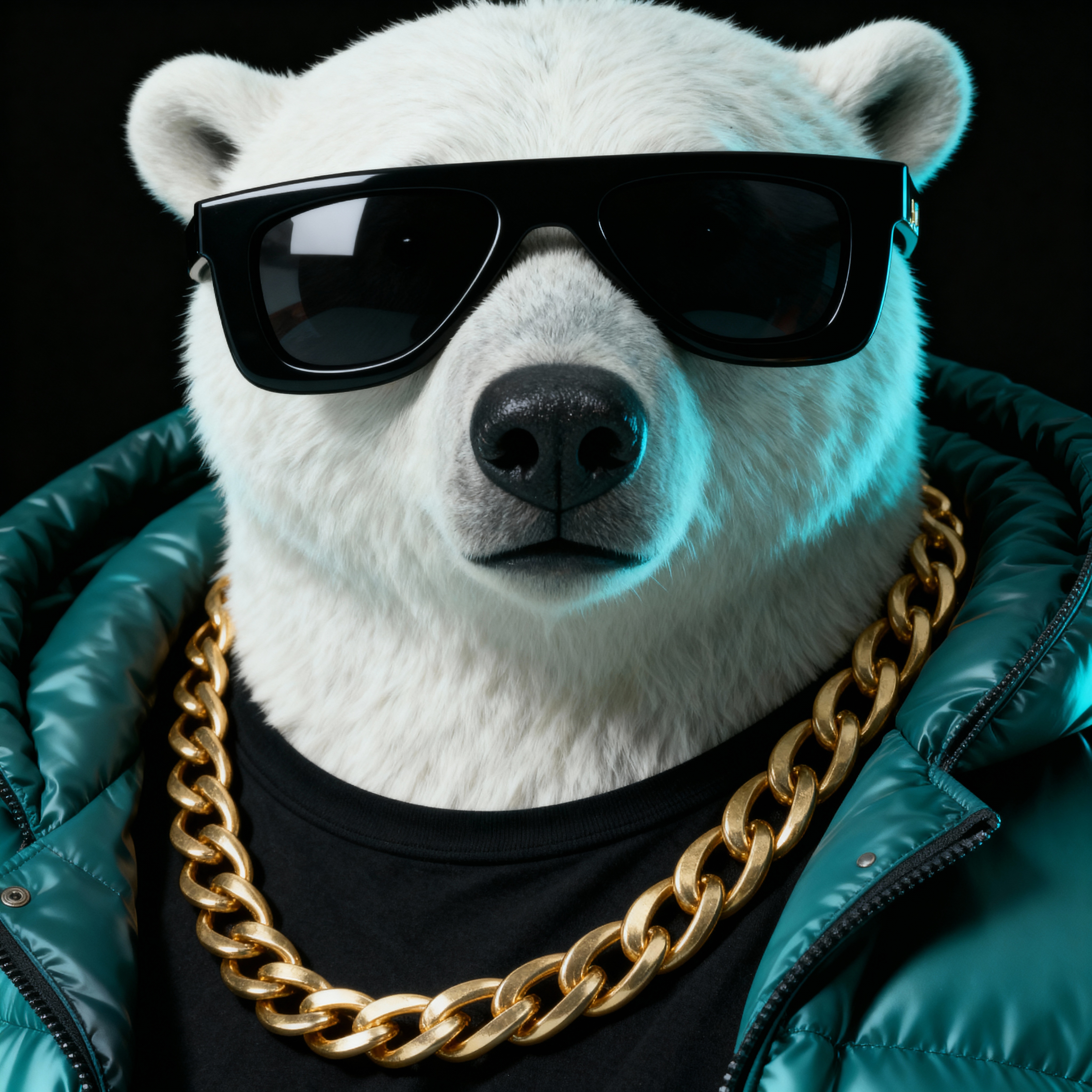
Bold. Strong. Unmissable.
Photography should feature modern, well-lit workspaces with a clean and organized feel. The focus should be on clarit, avoiding clutter or overly dramatic compositions.
Clean & Casual
Photography should feature modern, well-lit workspaces with a clean and organized feel. The focus should be on clarit, avoiding clutter or overly dramatic compositions.
Clean & Casual
Photography should feature modern, well-lit workspaces with a clean and organized feel. The focus should be on clarit, avoiding clutter or overly dramatic compositions.

Do This
Use the bears with purpose.Choose the bear that fits the mood of the moment. Polar for cool clarity. Black for bold impact.
Keep lighting and colour consistent.Mint visuals rely on clean gradients, cool tones and crisp highlights. Maintain the look.
Let the bears breathe.Give them space in layouts so they feel iconic and intentional, not squeezed or cluttered.
Match their energy to the message.Polar bear for smooth product moments, onboarding and premium screens. Black bear for hype, rewards, promos and loud announcements.
Use high quality renders only.Always use approved artwork or generated assets that match the official style. No mixing styles or off-brand lighting.
Keep them modern and stylish.
The bears represent Mint culture.
Use them in ways that align with the brand’s clean and confident personality.
Don’t Do This
Do not roll your own.Don't use AI to make your own version of the bear and use this in collateral. Only used approved artwork.
Do not add off-brand colours or effects.No warm glows, heavy filters, neon pinks, grain overlays or random textures.
Do not meme them in official material.The bears can be playful but should always stay premium and on brand.
Do not place them on busy or chaotic backgrounds.They should always feel clear and readable.
Do not mix them with unrelated art styles.No cartoon cutouts, no photoreal animals, no low quality renders.
Do not change their outfits, chains or glasses without approval.Their look is part of the brand identity.
05
STYLE
Our visual style is clean, modern and premium. Every asset should feel intentional, polished and consistent across platforms. From product shots to partnerships and merchandising, we keep our look focused on clarity and confident simplicity. The goal is to make Mint instantly recognisable wherever it appears.
Product Style
Our product visuals use high fidelity 3D animation with a clean, Apple level finish. Devices should feel crisp, modern and premium, with smooth lighting and a polished look. The focus is always on clarity, showing the product in a way that feels intentional and effortless.
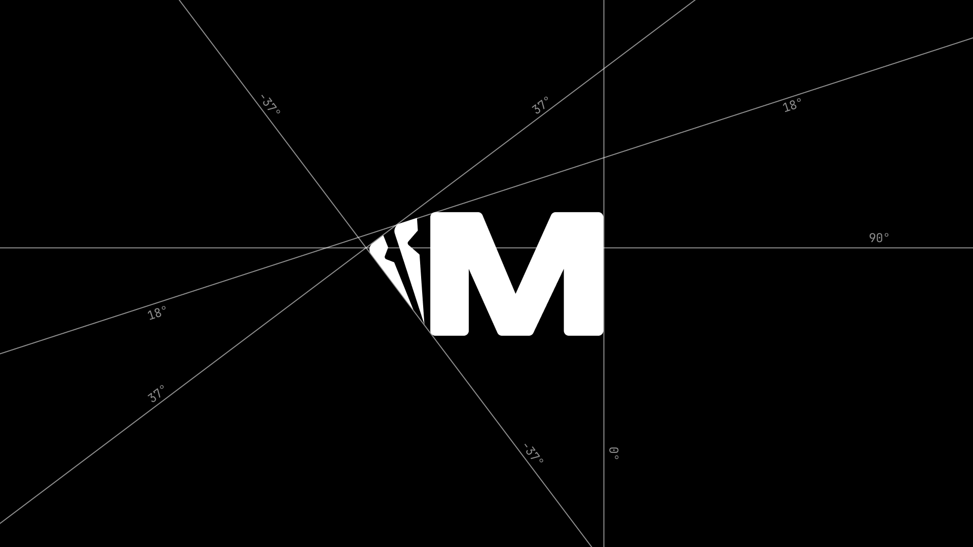
Icons & Style
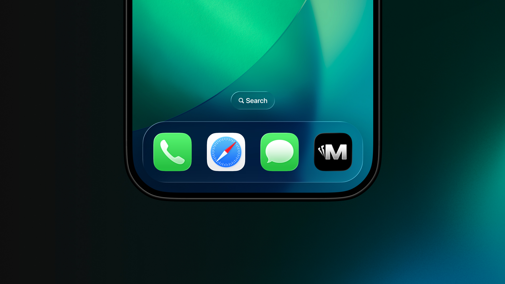
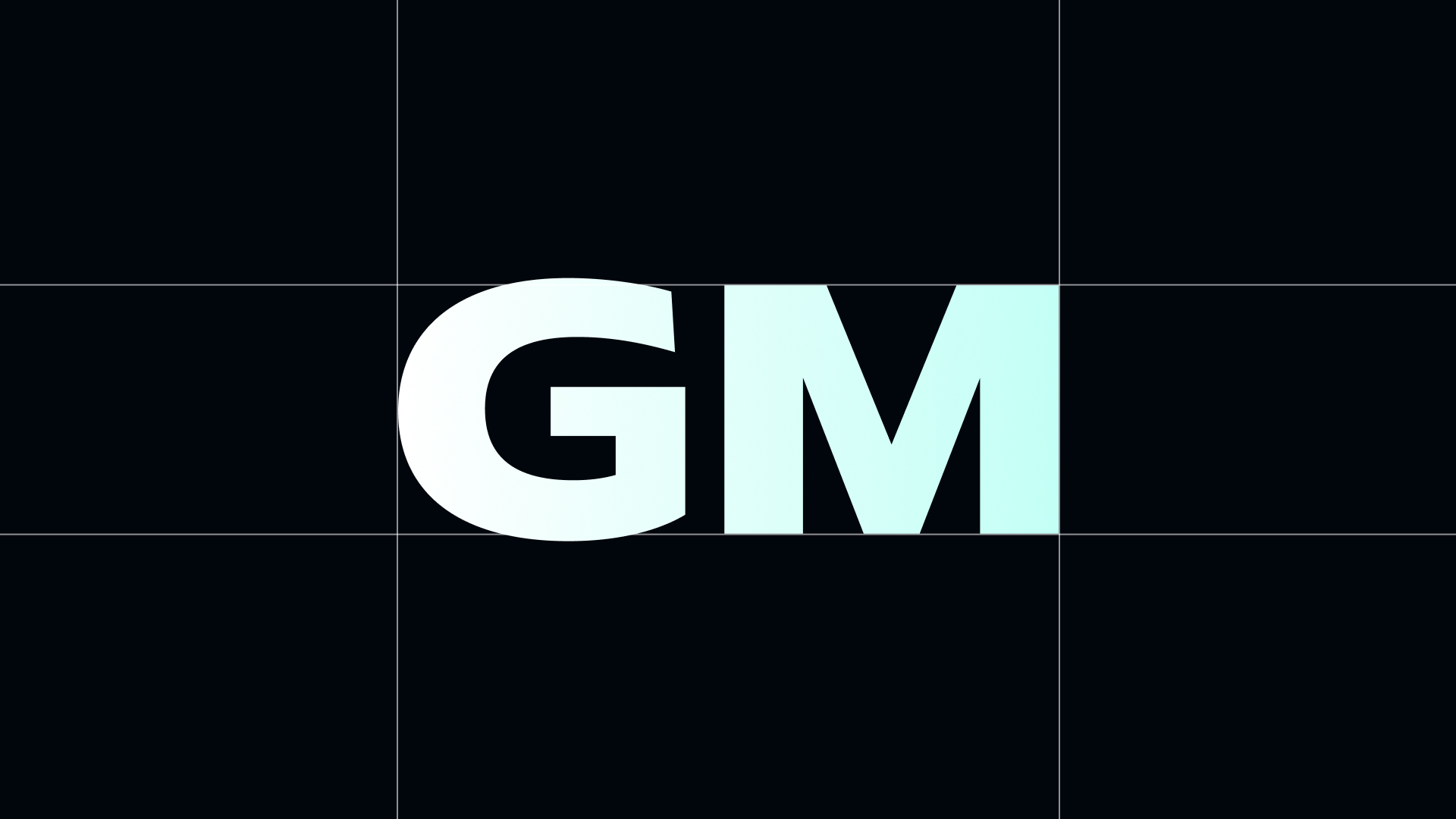
Our icon is always the clean white M on a solid black background. This is the version used everywhere. iOS, Android, X, Instagram, TikTok and any other surface that displays our app or brand symbol.
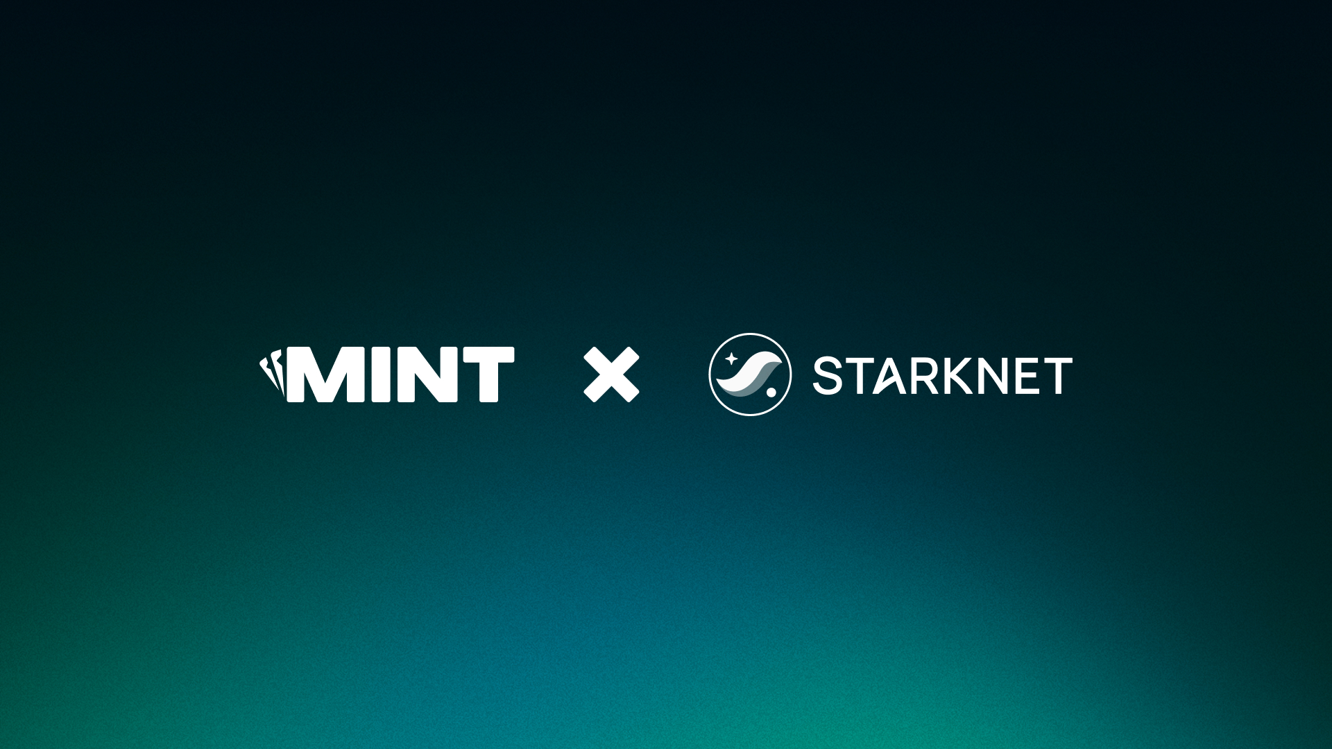
Partners Style
Partnership visuals should feel modern, balanced and confidently minimal. Logos sit on clean gradients with clear breathing room and no clutter. The layout should feel premium and intentional, highlighting the strength and quality of the collaboration.
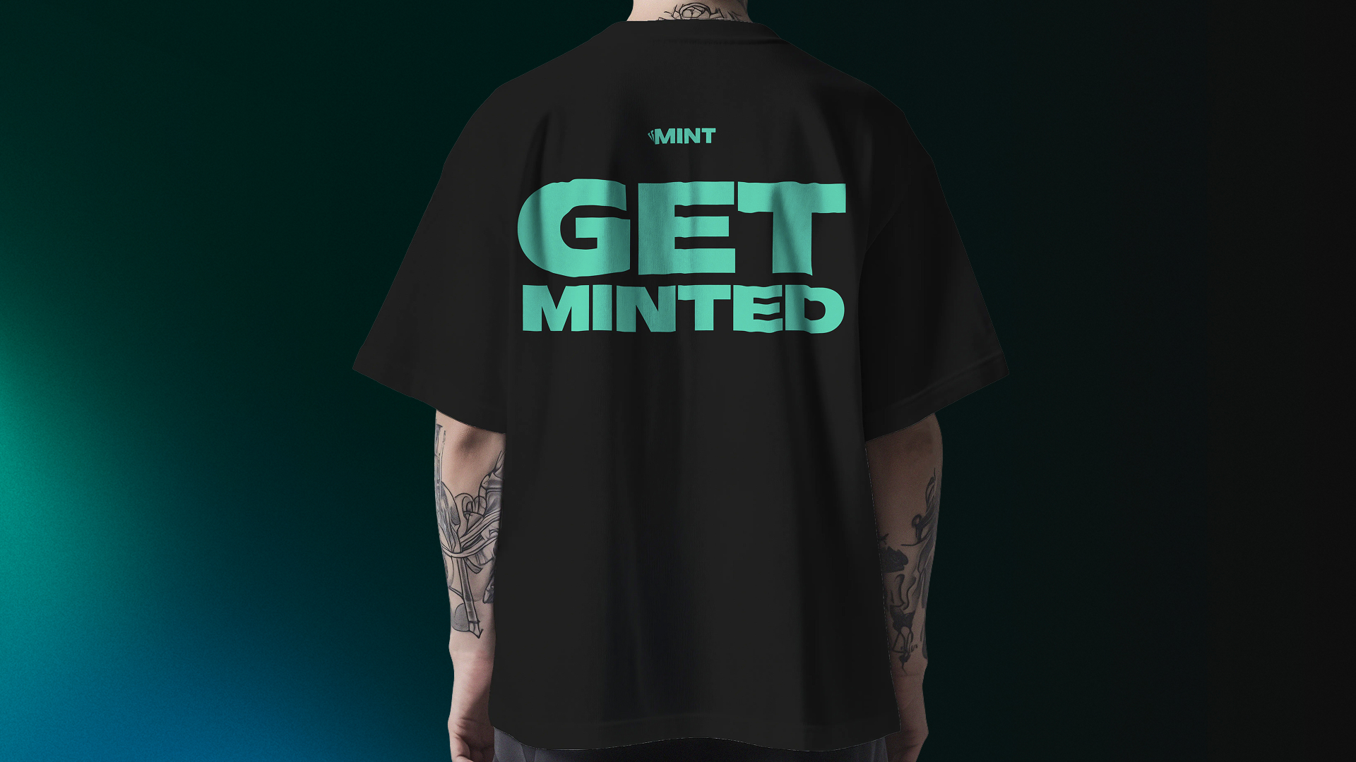
Merchandising Style
Merch shots are bold, simple and built around strong statements. Items should be lit cleanly to highlight texture and colour, with plenty of negative space. The goal is to keep things sharp and modern while letting the Mint brand speak with confidence.
06
Color
Redo’s color palette is designed to evoke trust, reliability, and financial clarity, ensuring that every touchpoint reflects our commitment to accuracy and efficiency.
Together, these colors create a strong, dependable, and forward-thinking brand identity, ensuring that Redo is instantly recognized as the go-to solution for financial corrections and optimization.
Primary Palette
Primary Lighter
Hex: #C8FFF6
Primary Light
Hex: #5DFFE5
Primary
Hex: #00C5A3
Primary Dark
Hex: #007561
Primary Darker
Hex: #00241D
Gradients

Top Center
Bottom Center

Top Left

Top Right

Bottom Left
Bottom Right
Mono Palette
Primary Lighter
Hex: #C8FFF6
Primary Light
Hex: #5DFFE5
Primary
Hex: #00C5A3
Primary Dark
Hex: #007561
Primary Darker
Hex: #00241D
Secondary Palette
Primary Lighter
Hex: #C8FFF6
Primary Light
Hex: #5DFFE5
Primary
Hex: #00C5A3
Primary Dark
Hex: #007561
Primary Darker
Hex: #00241D
07
Typography
Mint’s typography is bold, modern and instantly recognisable. Our type pairing reflects the core of our brand. Clean style. Strong identity. A tech forward attitude that feels right at home in both gaming and Web3. Every headline and every line of copy should carry that same sense of clarity and confidence.
Mattone Bold is our primary typeface. It is wide, loud and full of presence. The curves are heavy. The silhouette is unmistakable. It delivers the punch we want in titles, headers and statements. When you see Matone, you know you are looking at Mint.
Manrope is our secondary typeface. Its geometric curves and balanced proportions give the brand a clean, contemporary feel. It keeps body copy clear, sharp and highly readable. The tone is modern, minimal and perfectly aligned with our product and our Web3 direction.
Together, these two typefaces create a balance of attitude and precision that defines the Mint voice. Bold where it matters. Clean where it counts.
Primary Typeface
MATTONE BOLD
Secondary Typeface
Manrope
From bonus drops to instant payouts, every spin and every wager is tracked on-chain, giving you total visibility over your play. No delays, no guesswork. Just fast, fair, verifiable gaming every time you log in.
Caption
1320% Leading
0% Tracking
From bonus drops to instant payouts, every spin and every wager is tracked on-chain, giving you total visibility over your play. No delays, no guesswork. Just fast, fair, verifiable gaming every time you log in.
Body
120% Leading
0% Tracking
From bonus drops to instant payouts, every spin and every wager is tracked on-chain, giving you total visibility over your play. No delays, no guesswork. Just fast, fair, verifiable gaming every time you log in.
Large Body
120% Leading
-1% Tracking
Built for Winners
Headings
90% Leading
-1% Tracking